Most mid-market companies don’t have a data problem — they have a decision problem. The data exists, scattered across a CRM, an ERP, a finance system, and a dozen spreadsheets. What’s missing is a fast, trustworthy way to turn it into decisions. That’s what business intelligence is supposed to fix, and it’s where BI dashboards earn their keep: consolidating fragmented data into a single, real-time view that a leader can act on. But BI done wrong is just as common — expensive tools nobody opens, dashboards that answer questions no one asked. This guide is the decision framework we use to get it right: what BI dashboards actually deliver, how to measure the ROI, and how to choose and implement the right setup at mid-market scale.
What business intelligence dashboards actually are
A BI dashboard is an interactive tool that consolidates data from across your systems and presents it as key metrics a decision-maker can read at a glance. Instead of waiting for a static month-end report or digging through spreadsheets, leaders track their key performance indicators (KPIs) in real time and move from reacting to anticipating.
It helps to separate two terms that get used interchangeably:
- Data analytics is the process of examining raw data — through statistical analysis, modeling, and data mining — to find trends, patterns, and predictions.
- Business intelligence is the broader layer of tools and practices — dashboards, reporting, visualization — that turns that analysis into something a decision-maker can use.
Analytics produces the insight; BI puts it in front of the right person in a usable form. In practice, most organizations run three kinds of dashboard, and the distinction matters when you’re choosing what to build first:
- Operational dashboards track day-to-day performance — today’s sales, current inventory, live system health.
- Analytical dashboards support trend analysis and deeper data exploration.
- Strategic dashboards align a small set of high-level metrics with long-term business goals for the leadership team.
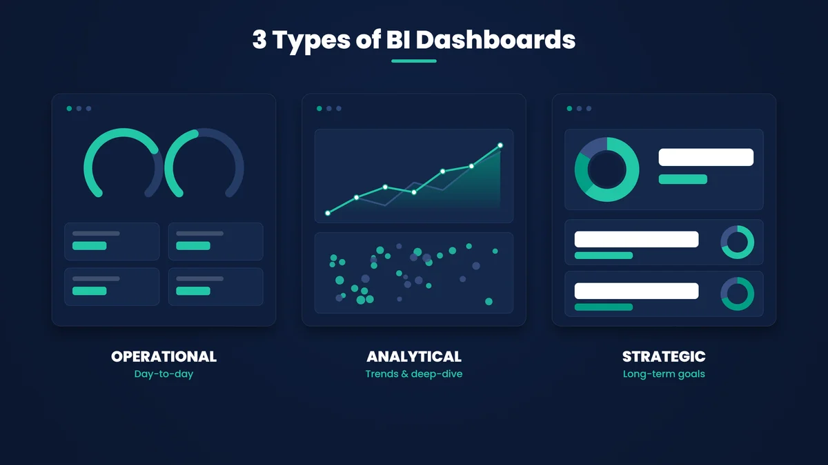
Getting the type right is the difference between a dashboard that drives a daily standup and one that informs a board meeting. They are not the same tool.
The benefits of BI dashboards — and where the ROI comes from
The benefits of BI dashboards are easy to list and easy to over-promise. The ones that actually move the numbers, based on what we see in production, are these:
- A single source of truth. Consolidating finance, sales, operations, and HR data into one view eliminates the silos and the “whose number is right?” arguments. Everyone makes decisions off the same real-time figures.
- Faster decisions. When a CFO can watch cash flow live, or a CMO can see customer acquisition cost trending the wrong way this week rather than next month, the decision happens while it still matters.
- Better performance tracking. Measuring teams and processes against targets becomes continuous instead of quarterly — you spot the gap early enough to close it.
- Forecasting, not just hindsight. Good dashboards use historical patterns to anticipate revenue, demand, or inventory shortages, so resources get allocated ahead of the curve.
- Cost and efficiency gains. Visualizing where budget and effort actually go surfaces bottlenecks and waste that were invisible in spreadsheets — often the fastest, clearest return.
- Customer insight. Tracking behavior, preferences, and churn lets teams personalize and retain rather than guess.
- Competitive advantage. Speed and agility compound: the organization that sees a market shift first responds first.
Notice that every one of those is a decision getting better or faster — not a chart looking nicer. That’s the lens that separates dashboards worth paying for from decoration.
How to measure business intelligence ROI
“What’s the business intelligence ROI?” is the right question, and it has a concrete answer. Measure it by comparing the full cost of BI against the measurable outcomes over the same period.
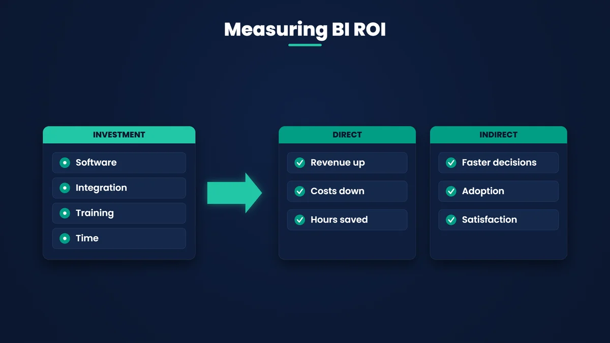
The cost side is more than the license: software, data integration, training, and the internal time your team spends building and maintaining dashboards.
The return side splits into two:
- Direct ROI — increased revenue, reduced operational cost, higher sales conversion, hours saved on manual reporting.
- Indirect ROI — faster decision cycles, better employee engagement, improved customer satisfaction. Harder to put a number on, but real.
The practical move is to measure ROI per department, because the returns land unevenly:
- Finance: budget forecasting accuracy, expense control, faster close.
- Sales & marketing: campaign ROI, lead conversion, customer segmentation, lower churn.
- Operations: supply-chain efficiency, fewer stockouts, process automation.
- HR: workforce productivity, attrition risk spotted early, engagement tracking.
A concrete pattern we see often: a dashboard surfaces an operational bottleneck that had been quietly costing money every month. Fixing it produces an immediate, attributable saving — and that single line item frequently covers the cost of the BI program itself. That’s how BI tools drive revenue growth and cost reduction in practice: not through the software, but through the decisions the software makes possible.
The decision framework: choosing the right BI
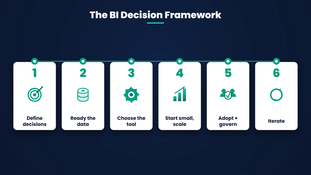
Here is where most of the value — and most of the failure — lives. Choosing and implementing BI at mid-market scale is a sequence of decisions, and the order matters.
- Start with the decisions, not the data. Name the decisions the business needs to make faster or better, then work backward to the KPIs and the data that support them. Define the decision first, then the KPI. Dashboards built the other way around — “here’s all our data, what can we show?” — are the ones nobody opens.
- Assess your data readiness. Audit where data lives, how clean it is, and how well systems connect. Integration complexity, not the choice of BI tool, is where most mid-market rollouts stall.
- Choose the tool for your context. Match the platform to your existing stack, your team’s skills, and your budget — covered in detail below.
- Start small, then scale. Deliver one high-value dashboard for one department, prove the return, then expand enterprise-wide. A phased rollout de-risks the spend and builds momentum.
- Drive adoption and governance together. Invest in training and simple interfaces so people actually use the dashboards — while keeping data access governed so self-service BI doesn’t become a security or accuracy problem.
- Iterate on real usage. Refine dashboards based on how they’re actually used and how the business questions evolve. BI is a living capability, not a one-time deployment.
Choosing a BI tool: Power BI vs Tableau vs Qlik vs Looker
There’s no universally best BI tool — there’s the one that fits your context and that your team will adopt. Here’s how the leading platforms compare on the dimensions that decide it:
| Dimension | Power BI | Tableau | Qlik | Looker |
|---|---|---|---|---|
| Best for | Microsoft-stack organizations | Visualization-heavy analytics teams | Associative, exploratory analysis | Cloud-native & embedded analytics |
| Key strength | Deep Excel & Azure integration; low entry cost | Best-in-class visual exploration | In-memory associative engine | Governed modeling layer (LookML) |
| Learning curve | Low–moderate (familiar to Excel users) | Moderate | Moderate–steep | Steep (needs data modeling) |
| Cost model | Low per-user; capacity tiers | Higher per-user (Creator/Explorer/Viewer) | Mid–high | Higher / enterprise |
| Mid-market fit | Strong — lowest friction to start | Good if visualization is the priority | Moderate | Best for data-mature teams |
For most mid-market organizations already on Microsoft 365, Power BI is the lowest-friction starting point — it connects natively to Excel and Azure, handles datasets far larger than a spreadsheet can, and by Microsoft’s own count is used across a large majority of the Fortune 500. If your priority is depth of visual exploration, Tableau is the stronger choice. We go deeper on that specific decision in Power BI vs Tableau, and on getting more from your visuals in advanced data visualization techniques in Power BI. (Tools like Google Analytics, QlikView, and SAS also have their place for specific web-analytics or advanced-statistics needs.)
Turning scattered data into decisions?
Our Business Intelligence practice designs dashboards and reporting around the decisions your teams actually make — and the KPIs that drive them.
Implementing BI at mid-market scale
Mid-market is its own context: you have real complexity but not an enterprise data team or budget to absorb a false start. Three challenges come up almost every time, and each has a practical answer:
- Implementation cost. BI can look expensive up front. Offset it with a phased rollout — one department, one clear return — so the program funds its own expansion instead of asking for a big bet on day one.
- Data integration complexity. Data spread across disconnected systems is the real bottleneck. Use connectors and cloud data platforms to unify sources before layering dashboards on top; skipping this step is the most common reason rollouts stall.
- User adoption resistance. A dashboard nobody trusts or understands is wasted spend. Address it with change management, simple role-specific interfaces, and visible leadership use — when executives run meetings off the dashboard, adoption follows.
Manage those three proactively and the mid-market rollout that so often drags for a year lands in a quarter.
Where BI is heading
The direction of travel is worth planning for, because it changes what you should build today:
- AI and augmented analytics — dashboards that flag anomalies, surface patterns, and increasingly recommend actions rather than just displaying data.
- Natural language queries — executives asking a dashboard a question in plain English instead of waiting for an analyst to build a view.
- Embedded analytics — insight delivered inside the CRM, ERP, and daily-use apps people already work in, rather than a separate tool to log into.
- Real-time and mobile — streaming, mobile-optimized dashboards for decisions that can’t wait for a desk.
- Big data and IoT — dashboards fed by operational and sensor data at scale, bringing real-time operational intelligence into the same view.
The through-line: BI is moving from reporting the past to supporting the next decision. Build with that in mind and today’s dashboards won’t be obsolete next year.
Proof: BI that changed how a business runs
The framework isn’t theoretical. For Indira IVF — India’s largest fertility network, running 150+ clinics — fragmented, clinic-by-clinic systems meant no unified view and slow, manual reporting. We built a centralized platform with integrated analytics dashboards that gave leadership consistent, real-time visibility across every location. Reporting speed improved by 85%, and clinic onboarding by 75% — a direct, measurable return from putting the right data in front of the right decision-makers. The full Indira IVF analytics platform case study walks through the build.
Getting BI right
BI done right isn’t about buying the most powerful tool — it’s about a disciplined sequence: name the decisions, ready the data, choose the tool your team will use, start small, drive adoption, and iterate. Do that, and business intelligence stops being a cost center full of unopened dashboards and becomes what it’s meant to be: the fastest, most trusted path from data to a decision.
Want a BI setup built around your decisions, not a tool's feature list?
Talk to our team and we'll map the decisions you need to make faster to the dashboards, KPIs, and platform that get you there.